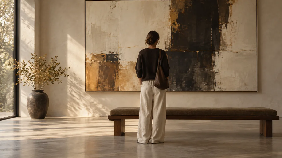
Color is a major player, long before your painting communicates anything to you via subject or composition. Color is communicating with you, nearly instantaneously; before your conscious mind is able to process what is happening in front of you. When entering a room with multiple canvases hanging side-by-side; your eyes immediately go to the color palette of each work of art. Your eyes go to the color, before your brain identifies the image of the person(s), place, etc. What is interesting about this is that it shows that color is not an afterthought added to a work of art. Color is a type of language unto itself. Color has a grammar and syntax and a vocabulary of feeling. And, color functions largely independent of what the work of art represents.
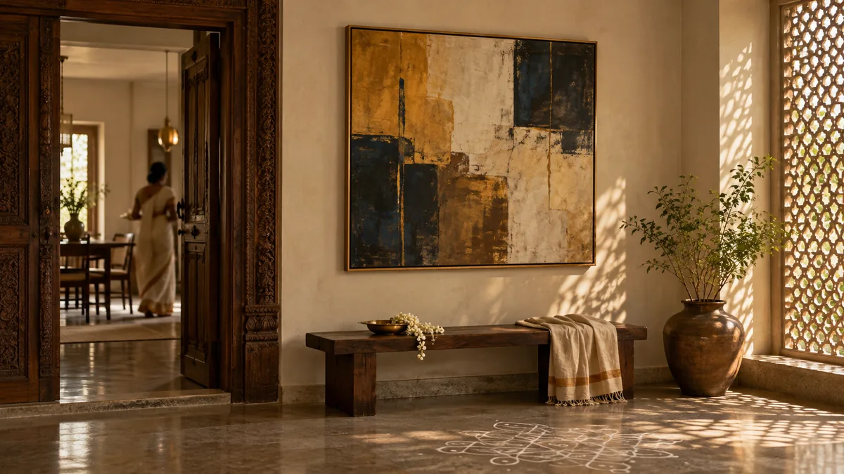
Compare two types of color palette, a palette made up of warm colors (ochre and red) versus a palette made up of cool colors (blue and grey). Before you identify what images either of these works of art depict, your body reacts to each in different ways. A palette of warm colors generally draws you towards the work. Warm colors cause feelings of comfort and closeness. Cool colored palettes generally pull you away from the work. Cool colors give feelings of distance and contemplation and melancholy. This reaction is not strictly based on cultural association. While culture does play a role in shaping our associations, there is a physiological reason for the way we react to warm and cool colors. Warm colors appear to move toward you. Cool colors appear to recede. Artists have known this intuitively for hundreds of years, long before scientists could describe why.
It is not just the fact that color gives us emotions, it is the way that a painter's use of color can become a sort of signature. Like handwriting styles, a painter's use of color can be identified. Two artists using the same palette of paints, can create completely different color moods due to how they apply the color. One painter may choose to create strong contrasting colors. He may put a bright red right next to a cool green with no transition space between the two colors. Creating a visual tension that feels instantaneous. Another painter may prefer to create subtle color gradations. Building his colors in thin, translucent layers. So that one color slowly emerges from another. Creating a mood of patience and accumulation instead of conflict. Each method has value. They represent two different grammatical systems. Both methods can convey emotion if used effectively.
The paintings I am referring to as "Deep Oceans" utilize luminous blues and very dark areas sitting very close to each other. The transitions from one area to another are done in such a manner that it is difficult to determine where one color stops and the next starts. This type of color application requires a specific amount of involvement from the viewer. The viewer cannot rely solely on quick glances at the painting to understand it. Rather, he needs to look at the painting for a considerable length of time. At first glance, he sees only a large field of dark blue. However, upon prolonged observation, he finds that there is significant color variation in what initially seemed like a uniform blue area. This type of color application functions similar to a slow reveal. A type of color grammar that relies on patience rather than immediate declaration.
I find the comparisons to spoken language helpful. A sentence can be constructed with short, direct statements or longer, more complex sentences with subordinate ideas. Each sentence type creates different rhythms and emotional effects. Similarly, a painter constructs visual sentences across the canvas using color. Strong contrasting colors are analogous to short, direct statements. Gradual color shifts are analogous to long, winding descriptions. With continued exposure to paintings over years, viewers develop an understanding of the painters' use of color almost like readers understand the rhythm of written language, including both pace and emphasis before consciously analyzing why.
Culture influences the associations we make with color in addition to providing an additional layer to the grammar of color usage. Since we deal with many diverse collections and traditions at West23, we consider cultural influence often. Associations related to black in many western artistic traditions are typically associated with mourning or seriousness whereas in some Indian devotional and folk traditions deep reds and golds are associated with celebration and good fortune and therefore are vastly different from the meanings commonly assigned in western tradition. Whether intentionally or unintentionally, artists operating across multiple traditions will inevitably bring prior associations into consideration when selecting colors for their palette and collectors' prior experiences will influence their interpretation of those color selections. Although this does not imply that color selection is arbitrary, it does indicate that color selection is not always fixed. Rather, meaning resides in the negotiations among three sources: the artist's intentions, the internal logic of the painting itself, and the individual history of experience that defines each viewer.
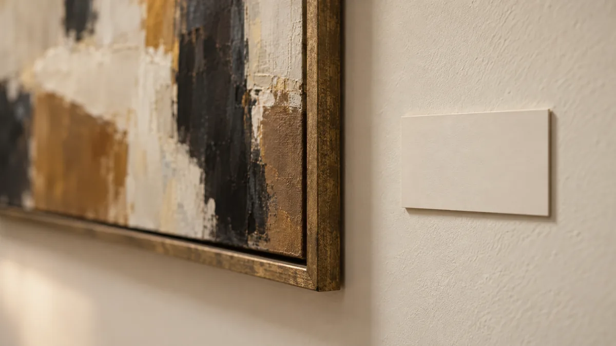
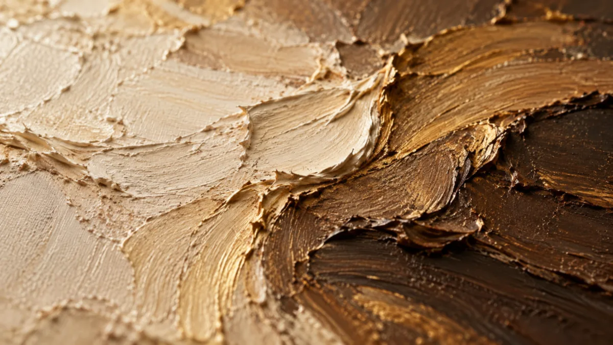
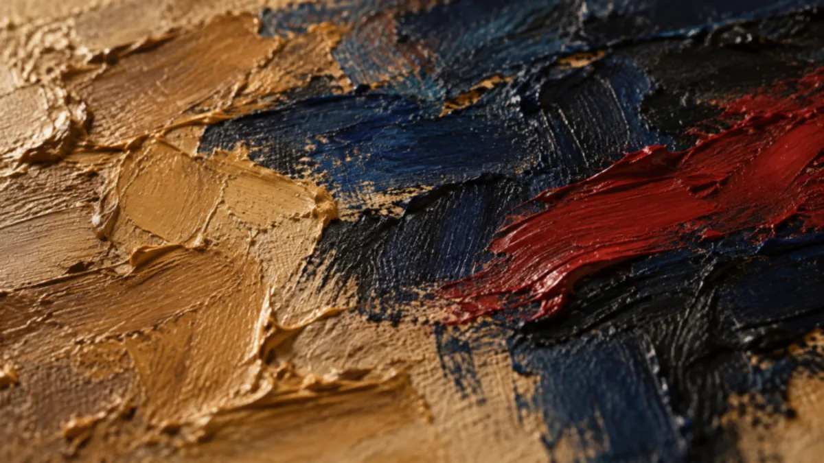
In addition to the above considerations regarding how color interacts with the physical properties of paint, an important aspect of how we perceive color that is often overlooked when reproductions exist: Physical characteristics of paint itself affect how we see color. For example: A thickly applied mixture of saturated red paint will behave differently under light than a thinly applied wash of the same red paint. When applying paint in an impasto technique, physical shadows fall within the textured surface creating internal modulation within a single-color field that varies as you move around it or as natural light changes during the course of a day/week/etc.. By contrast, when using a translucent wash technique, the color tends to remain relatively consistent in terms of perceived intensity whether viewed from various angles or under varying light conditions.
Therefore, in an original painting, color is inherently connected with physical gesture (the action of applying paint), stroke thickness (and thus the relative density of paint applied), pressure applied by brush/palette knife (thus influencing how dense/thick/medium/heavy/lite paint is applied), and so forth... These factors collectively define how a given color is ultimately experienced in the environment.
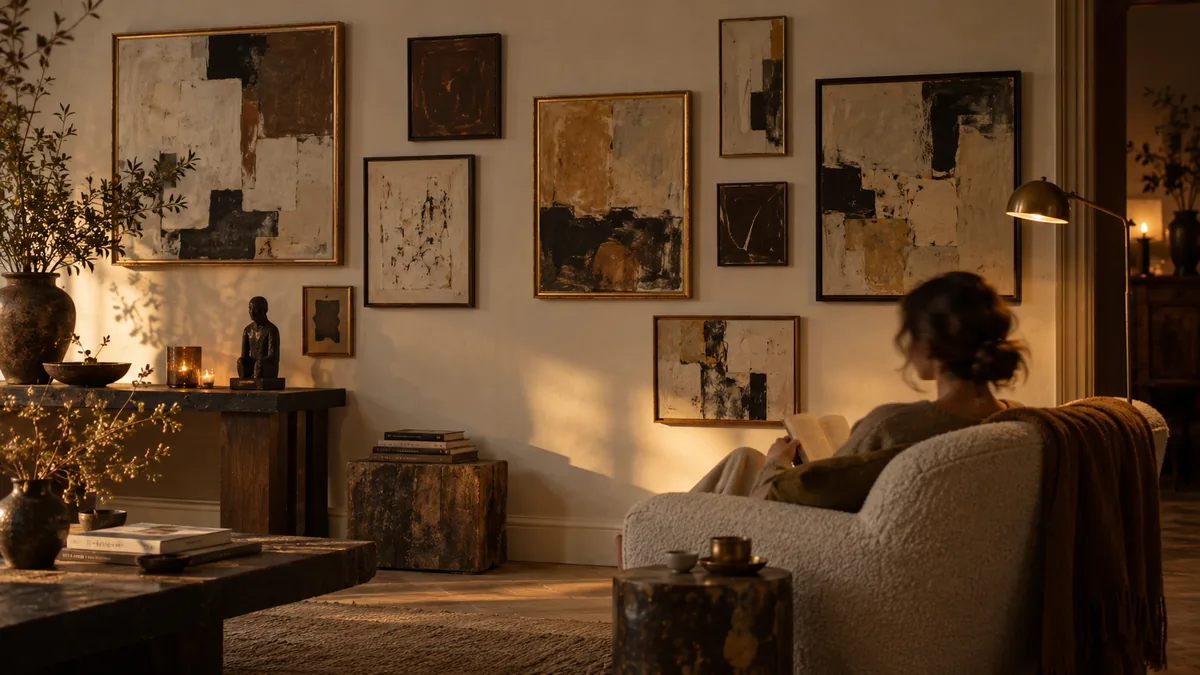
When collectors are assembling walls over time we frequently recommend considering color palette as carefully as they do content/subject matter. Color relationships between works on a wall create their own dialogue, sometimes harmonious and sometimes filled with productive tensions. Walls created exclusively with warm-saturated palettes can eventually grow too loud visually. Every canvas competes for dominance in expressing an identical emotional register. Conversely, walls containing combinations of warm and cool works allow each to provide contrast and relief for each other, similar to how a well-composed musical piece employs alternating moments of tension and release rather than maintaining a constant level of energy throughout.
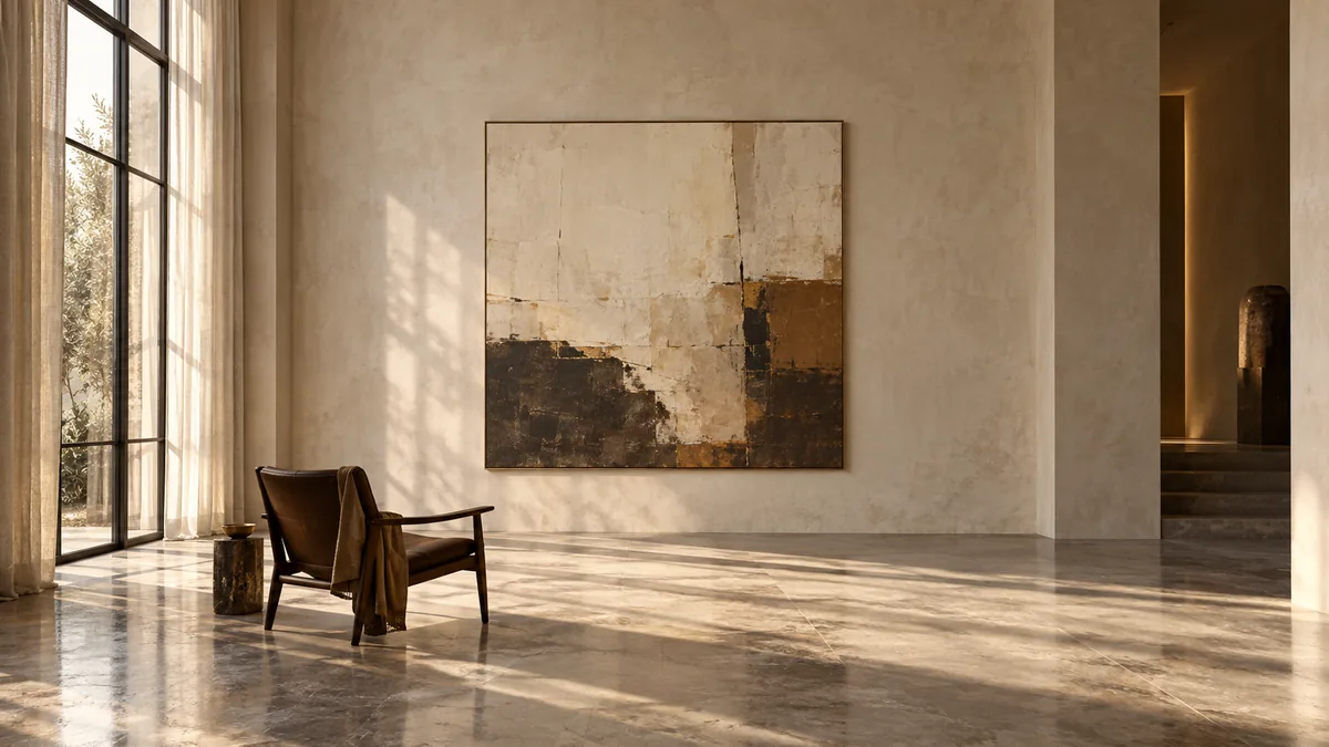
Finally, light itself is likely the ultimate collaborative partner in any painting's creation of its color language, and it bears noting that no artist ever totally controls how their palette will be interpreted after leaving their studio. Canvases developed under even, diffuse lighting provided by northern-facing studio windows can exhibit vastly differing interpretations when installed in homes receiving directional, warm sunlight during late-afternoon hours. Colors appearing cool-restrained under studio lighting can display unsuspected warmth under home lighting conditions; likewise: Color relationships appearing balanced in one environment can slightly alter in another environment. Ultimately, this is not indicative of an error in the painting; rather it illustrates how color (unlike line-composition) continues to interact with its surrounding environment throughout its lifespan; thus: never attaining a single-stable reading.
That is why we advocate encouraging collectors (when feasible): to examine their potential purchases under light conditions as closely approximating as possible those existing at their intended locations (homes/workplaces/etc.) before committing to purchase. A work of art displaying subtlety under gallery lighting may loudly declare itself in an ambient-lit dinner-room during evening hours; thus: collectors anticipating these differences foster more thoughtful associations with their chosen colors; reducing likelihood for surprises upon installation.
Ultimately: Color is arguably the most immediate least-analyzed language painted works communicate. We respond emotionally prior to realizing what else we understand about any work-of-art; and although we may believe this response is instinctive: it is informed by an extensive learned grammar articulated by the painter through years spent practicing. Understanding and perceiving this grammar, recognizing not only what colors exist but how they were selected, applied, layered, and set in motion together, unlocks meanings inherent within any work of art that cannot be accessed through subject matter alone.